Dark Light House
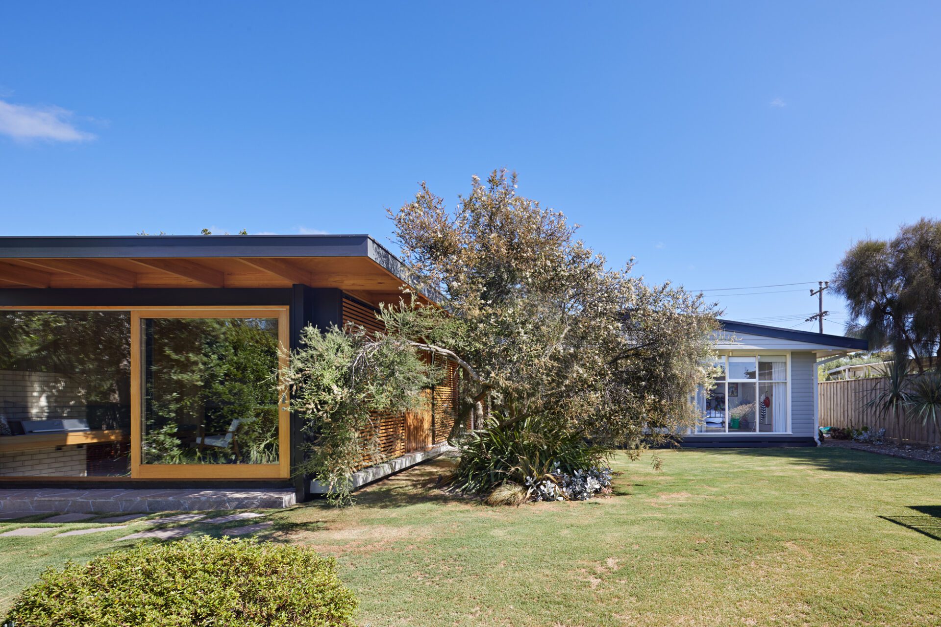
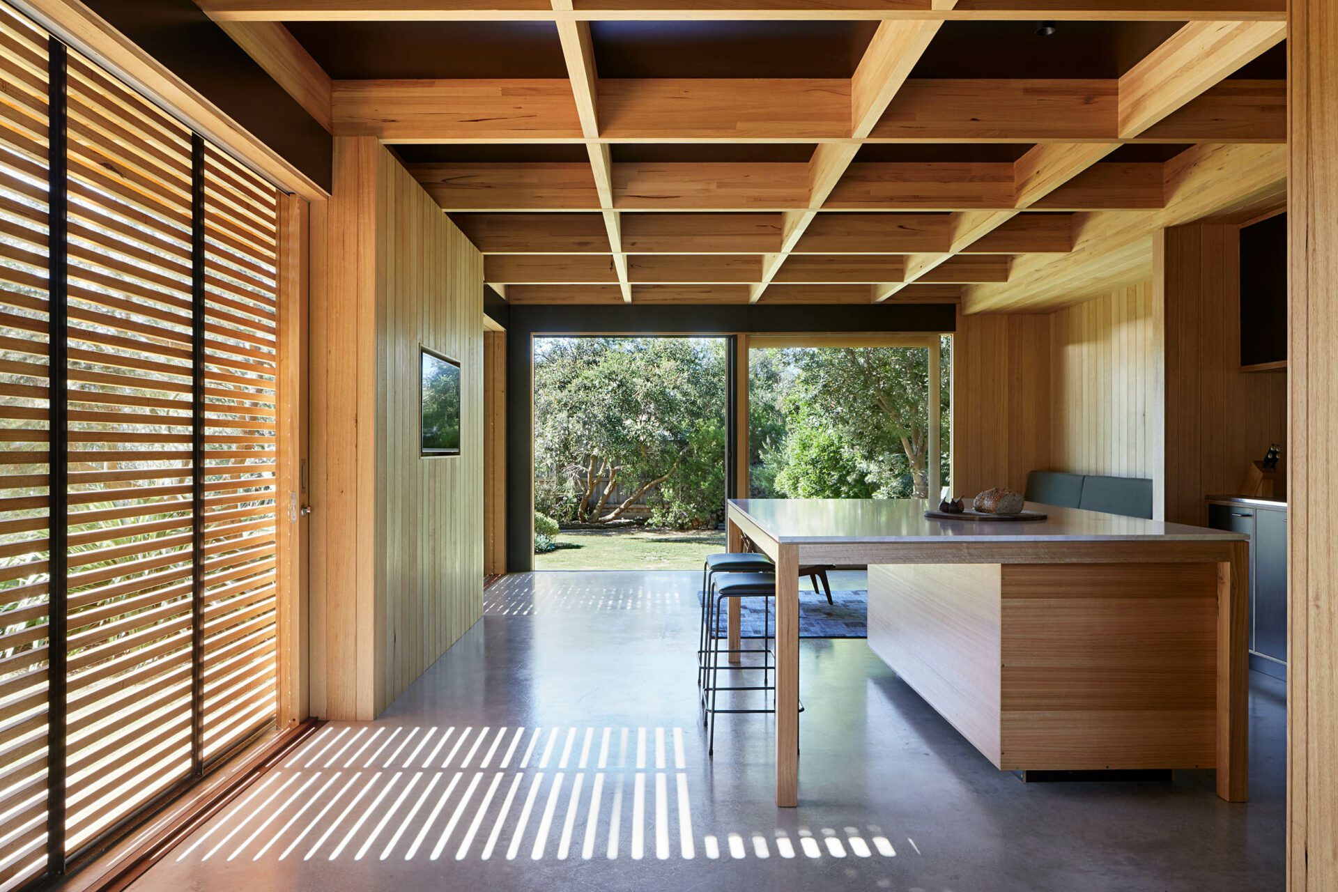
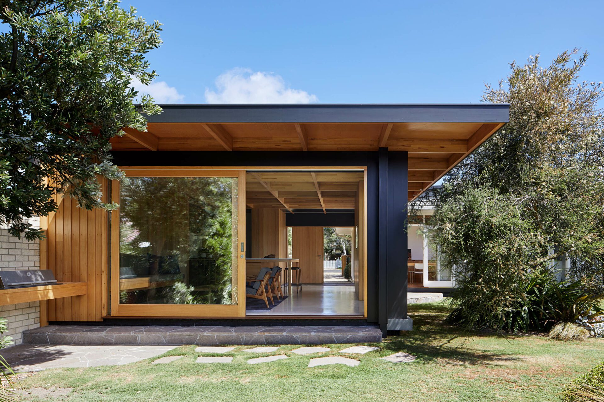
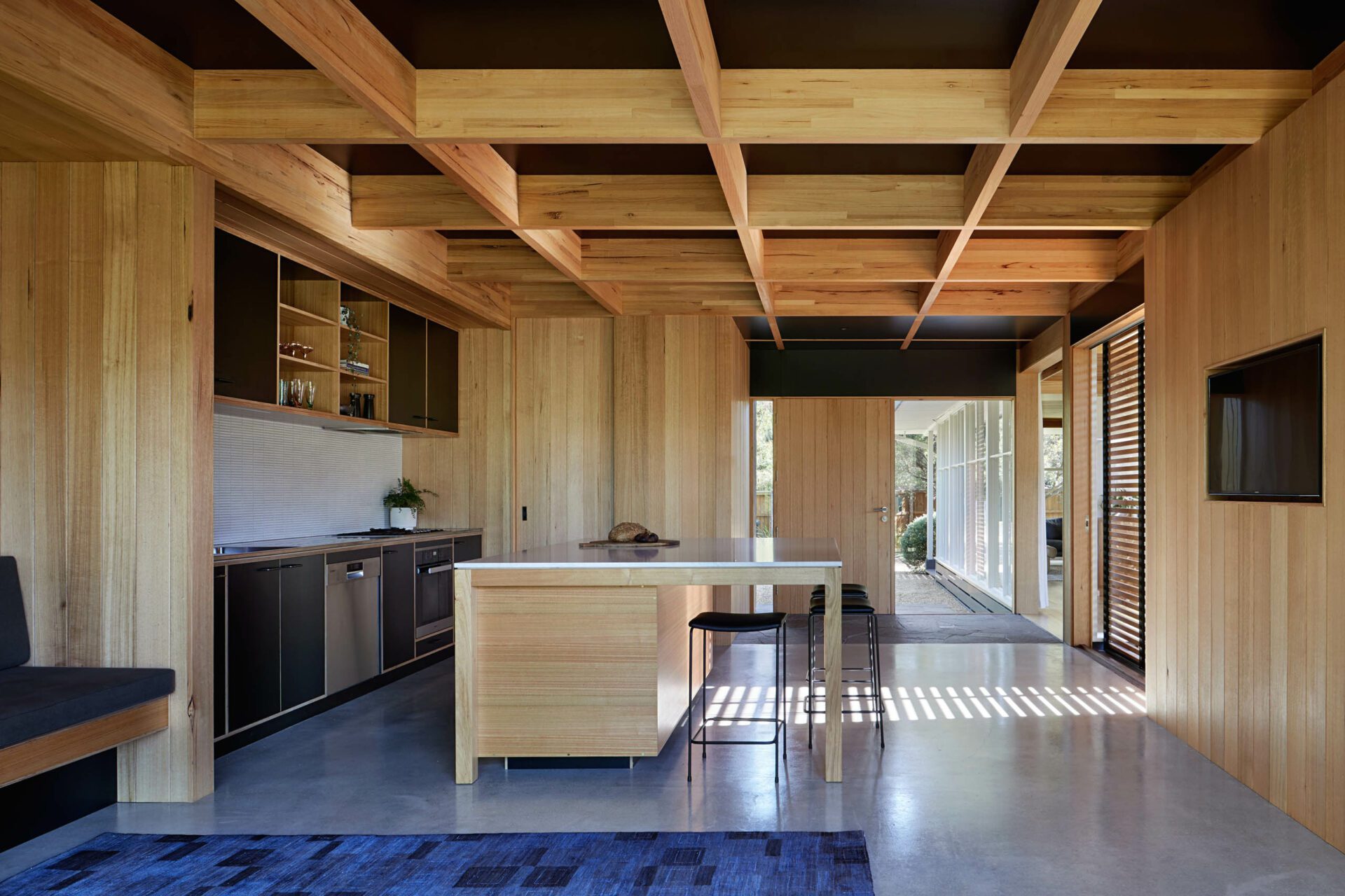
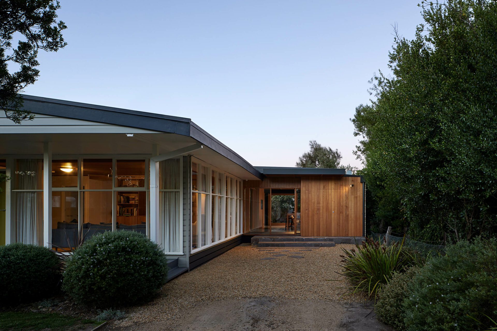
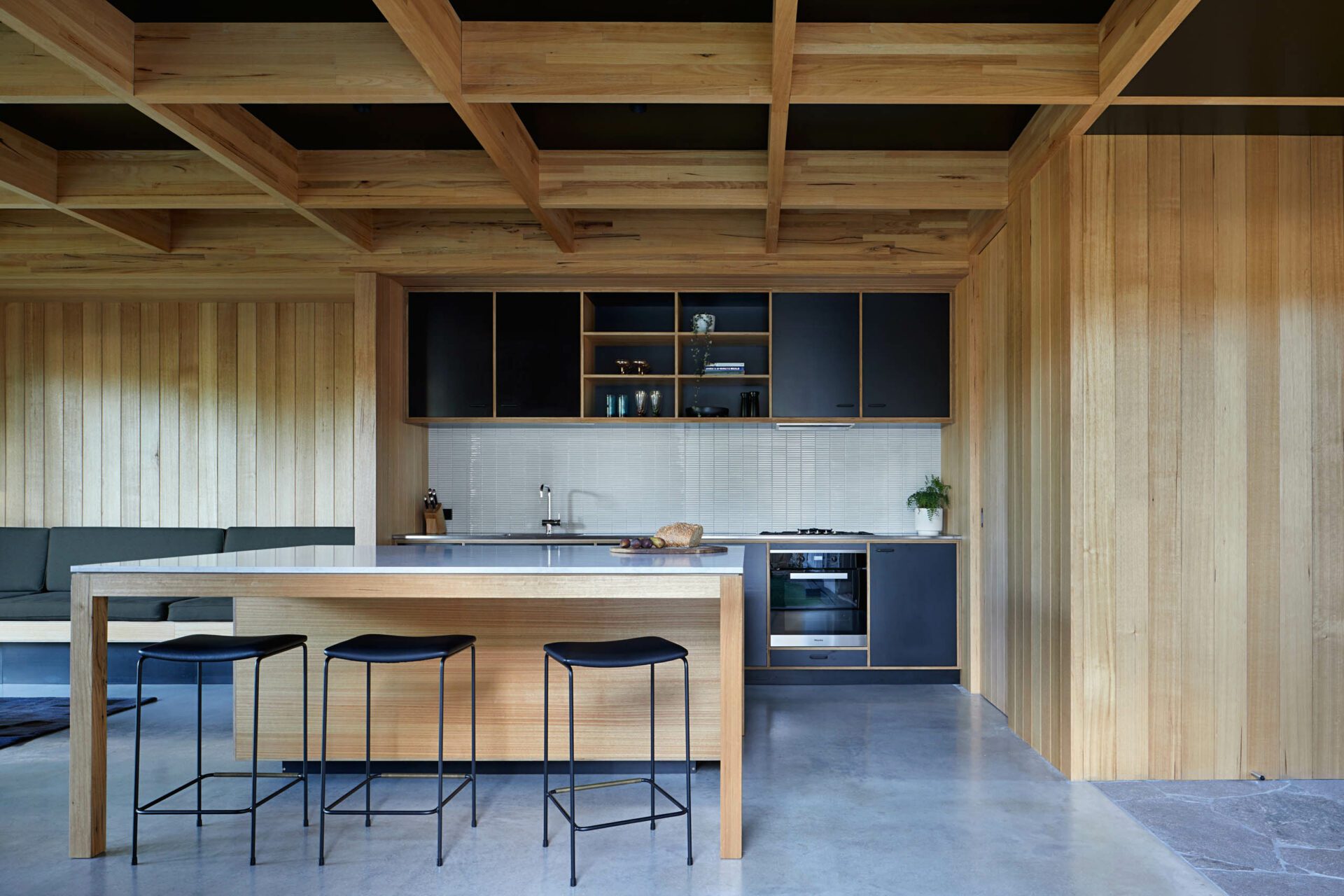
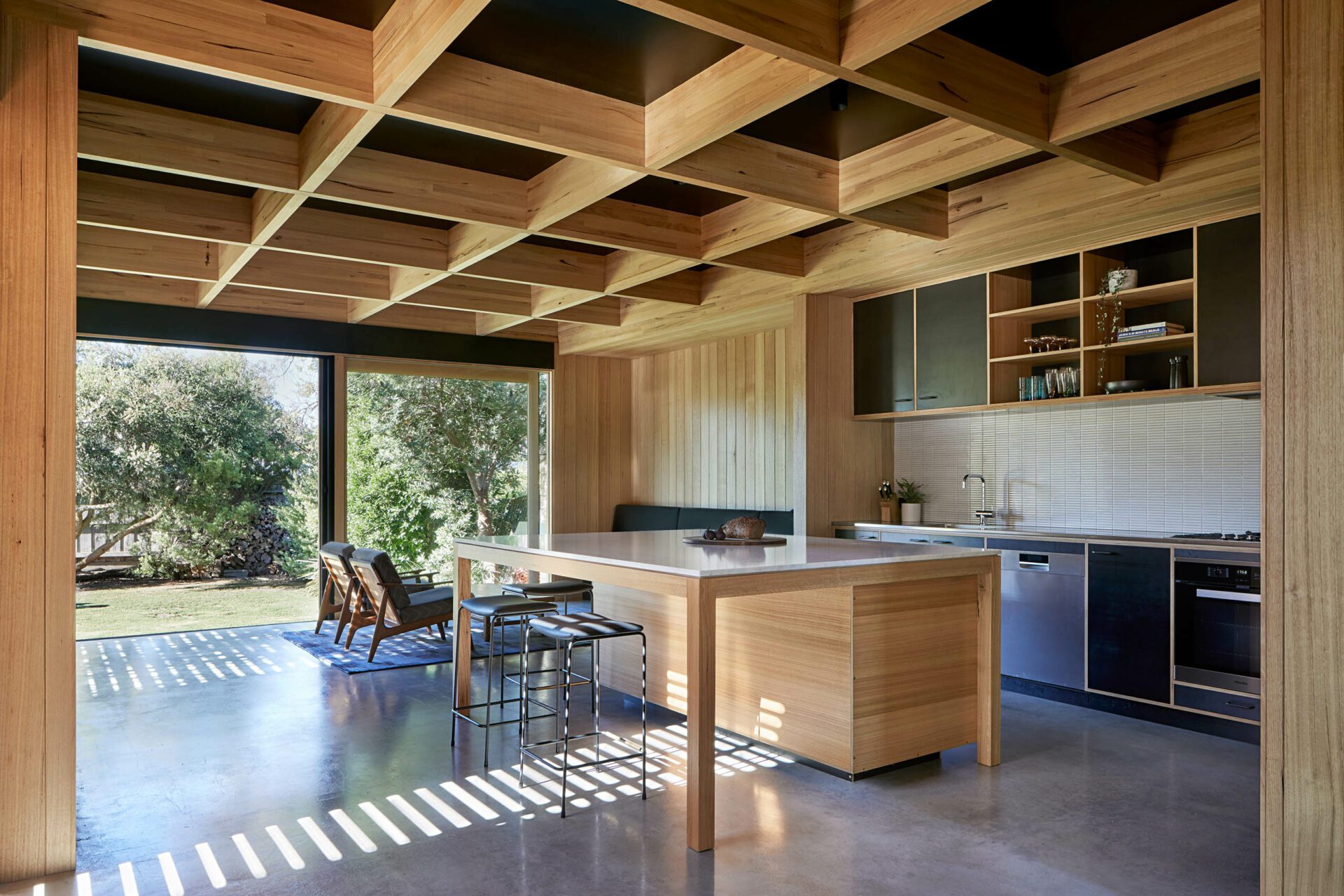

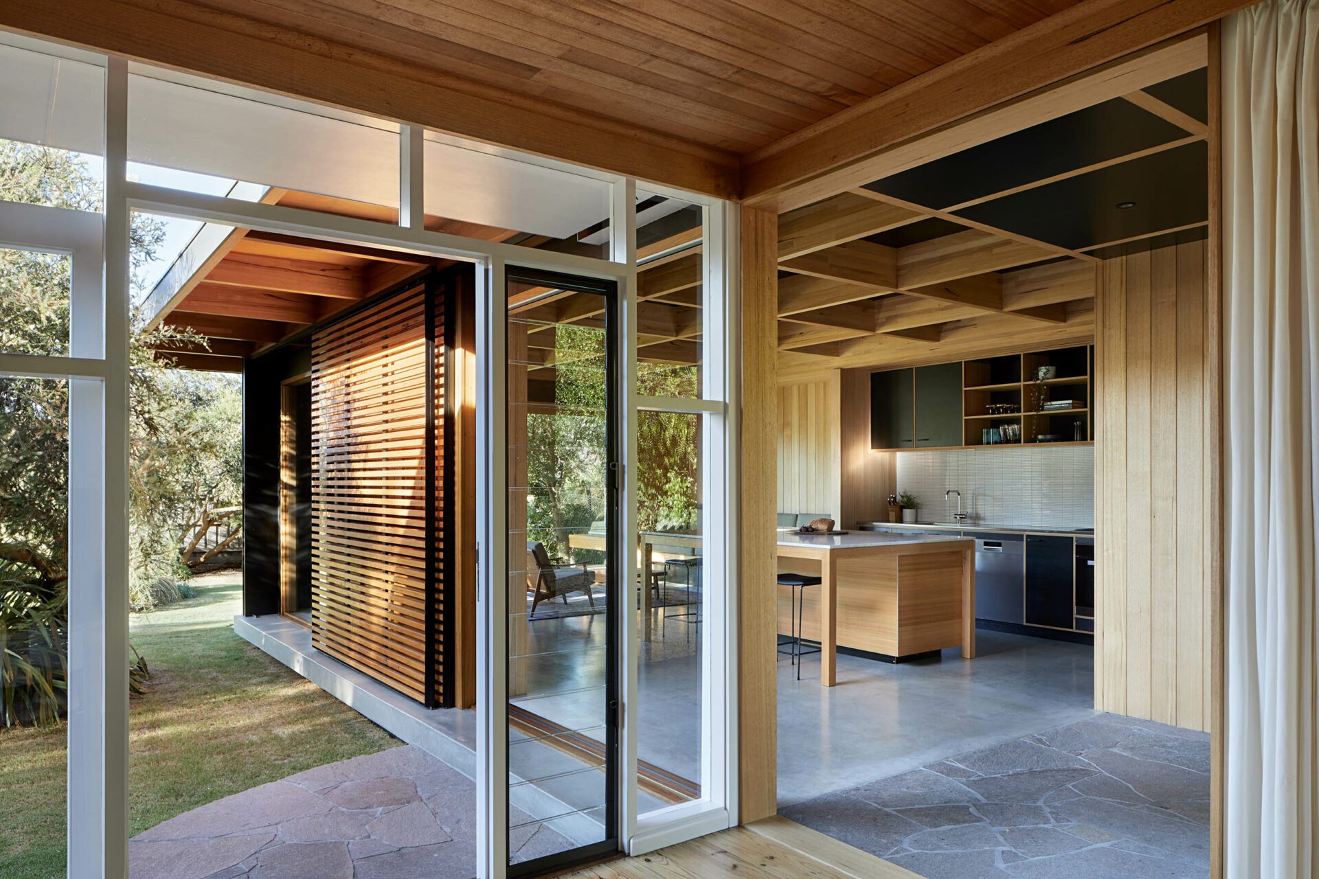
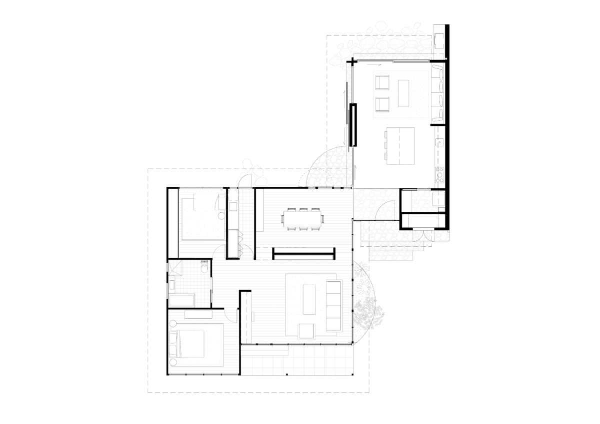
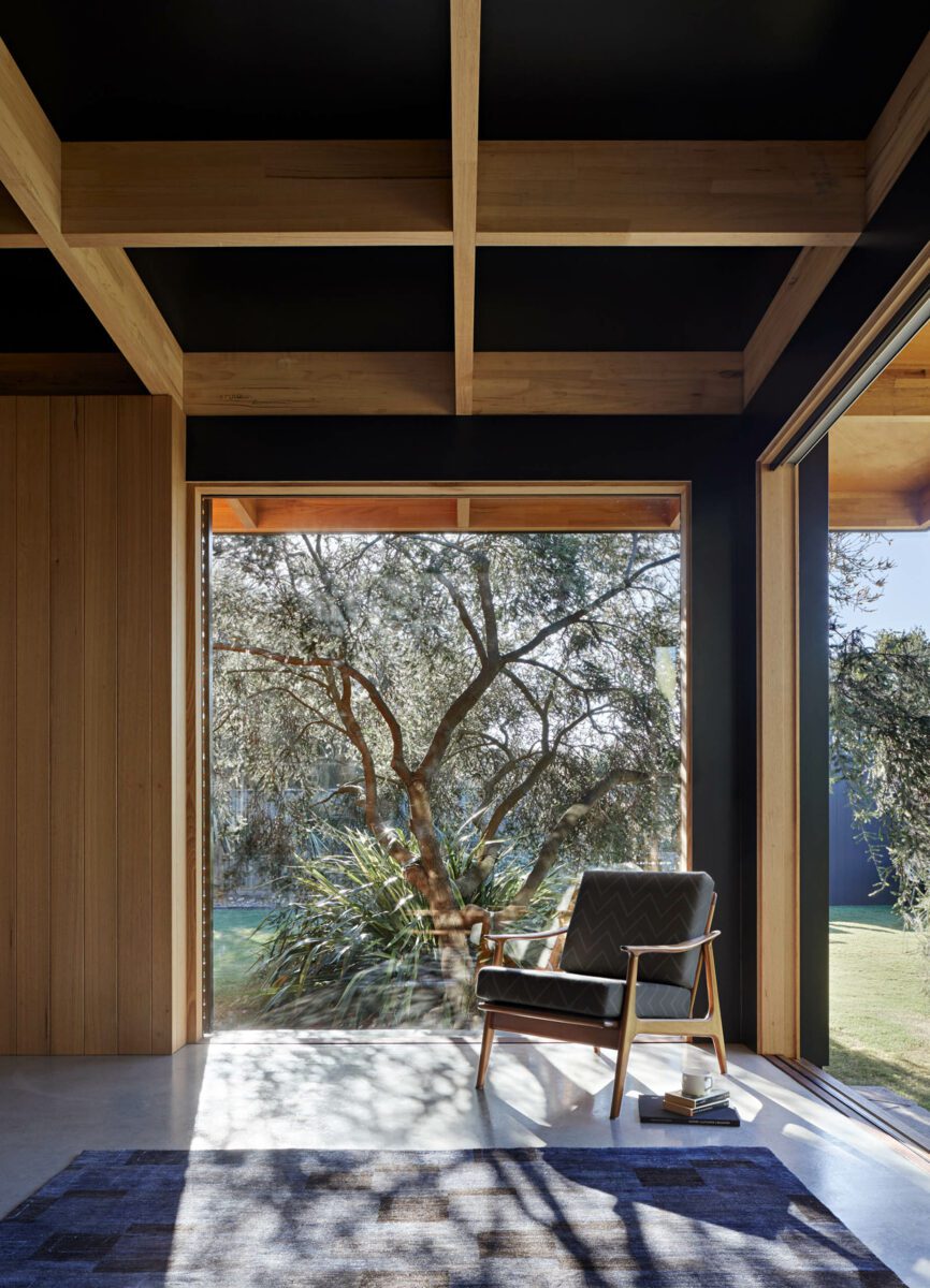
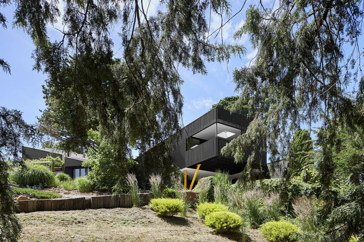
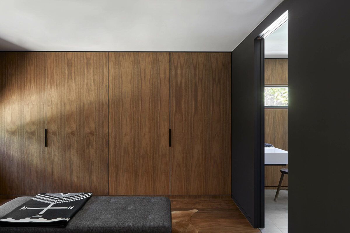
Located in Rye on the Mornington Peninsular, Dark Light House is a modest addition to a family home designed and built in the late sixties. Originally built as a holiday home the owners’ required additional living space but not at the expense of the detail and character of the original. Our design connects the addition to corner of the original and creates a play between light and dark, east and west, new and old. Through a minor intervention of the existing and a small addition the entire house is reimagined. The whole is greater than the sum of its parts.
The original holiday home, designed by Peter Fawns in 1966, possesses the traits of well-planned and efficient homes that were typical of the Small Homes Service. The house was remarkably intact and little changed over time with the exception of a bathroom upgrade. The clients’ favourite feature being the hardwood timber ceiling that had developed a rich patina over the past 50 years.
As a full time family home the house lacked the separation of living types that enables simultaneous activities to occur and the original but modified kitchen was also not living up to daily family life. Our brief was to provide a second living space and a new kitchen; the budget was limited and managed carefully – not changing from the outset of the project to completion. The most important component of the brief however was that the original house should be altered as little as possible. The assumption was the kitchen would be upgraded in its existing location with living space added to the east.
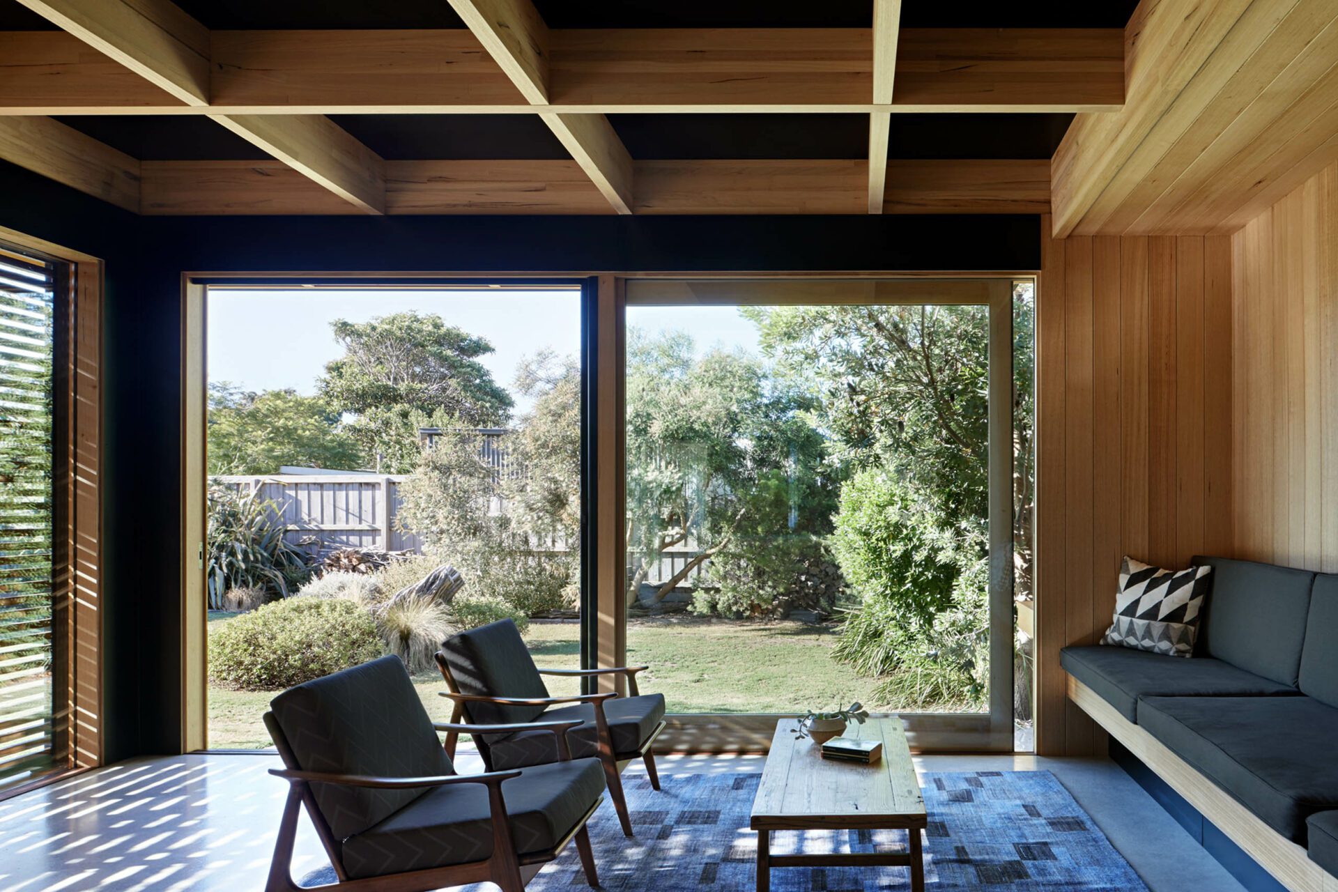
Our proposal was to locate a new pavilion that allowed for a place to eat, live and cook in while at the same time becoming the new front entry and access point to the back yard. Tentatively connected to the north-eastern corner of the original the addition pushes into the garden allowing the living room to frame a Moonah Tree that was particularly loved by the clients. The new pavilion duplicates the living area size the original, providing dining and living spaces in both the original and new areas of the home.
The addition was designed to compliment the original, refer to it but not to imitate. The intention was to provide contrast but in a way that was not simply doing the opposite. Design influences and construction techniques on the original design were considered, particularly the influence of Japanese architecture, the glazed walls that are part window frame part structural studs and low pitched roofs with generous eaves.
The addition retains the idea of the ceiling being the principle feature of the space. A baffle ceiling structure of hardwood glum-lam rafters provides the clear span structure while becoming the ordering principle for the plan below. West facing glazing continues the line of the original east facing window wall, sliding timber screens allow the occupants to control afternoon summer sun while the burnished concrete slab provides thermal mass in winter.
Photos by Tatjana Plitt
Built by Saltwater Builders
The details
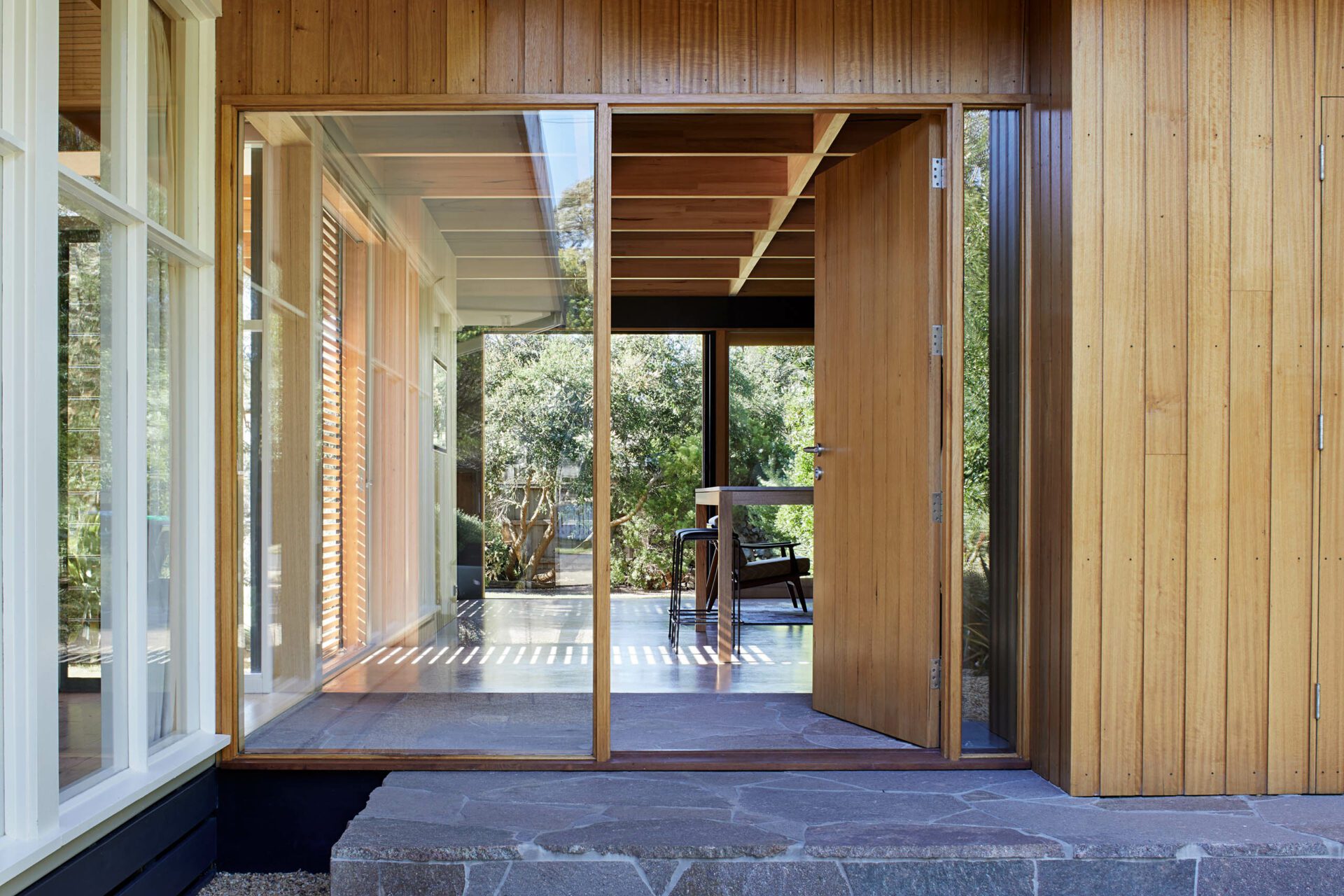

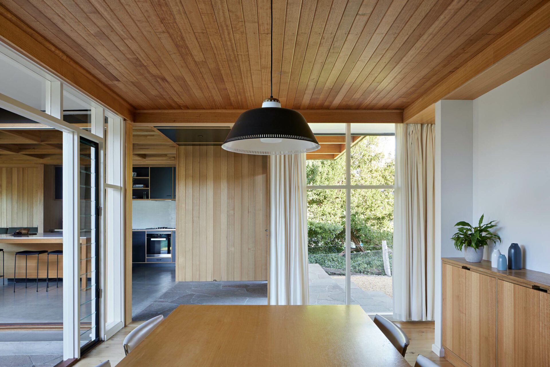
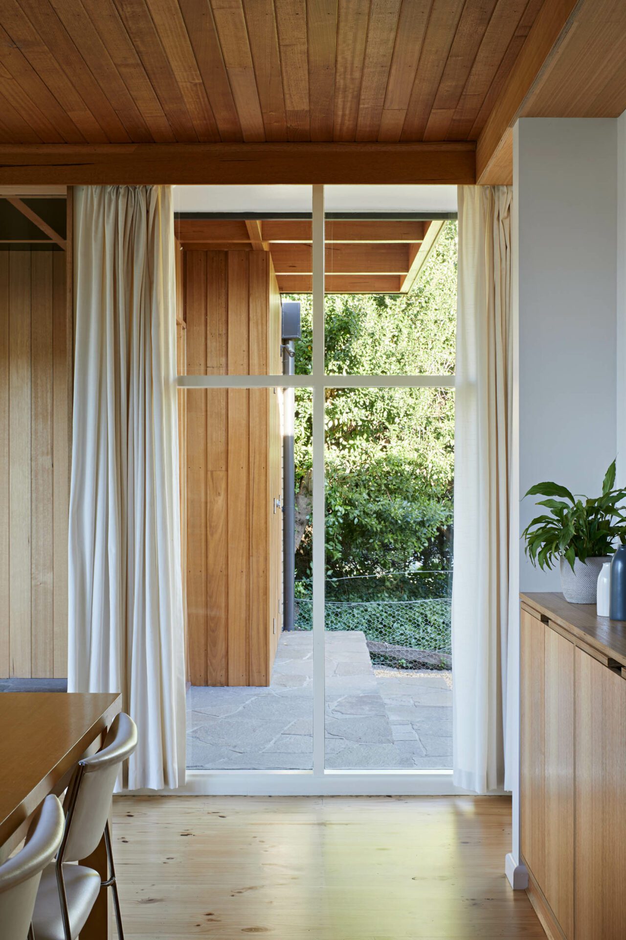
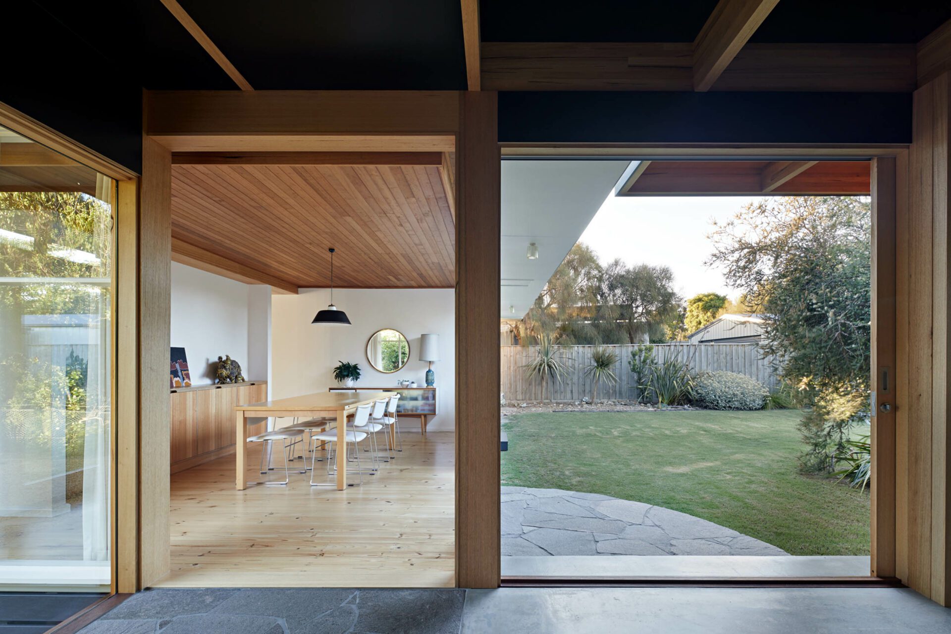
“When is a renovation not a renovation?”, In this project all that has changed in the original home is the removal of two adjoining window bays.
But it is this, a most simple and sensitive touch, that has allowed a 48sqm new addition to sit so comfortably beside the original 1966 Beach Shack.
A gentle harmony prevails and both boxes, old and new, are all the better for their new relationship. Each reinforces the other and the sensitivity of the new addition allows the simple honesty of the original house to shine through.
The architect’s deft hand has crafted the new addition, with a lightness of touch and economy of means which allows a gentle and peaceful new living room to emerge.
Awards
Australian Institute of Architects
Commendation for Residential Architecture - Houses (Alterations and Additions)
Press
Green Magazine - Issue #65
"A Cut Above - Dark Light House"
