Home Pavilion
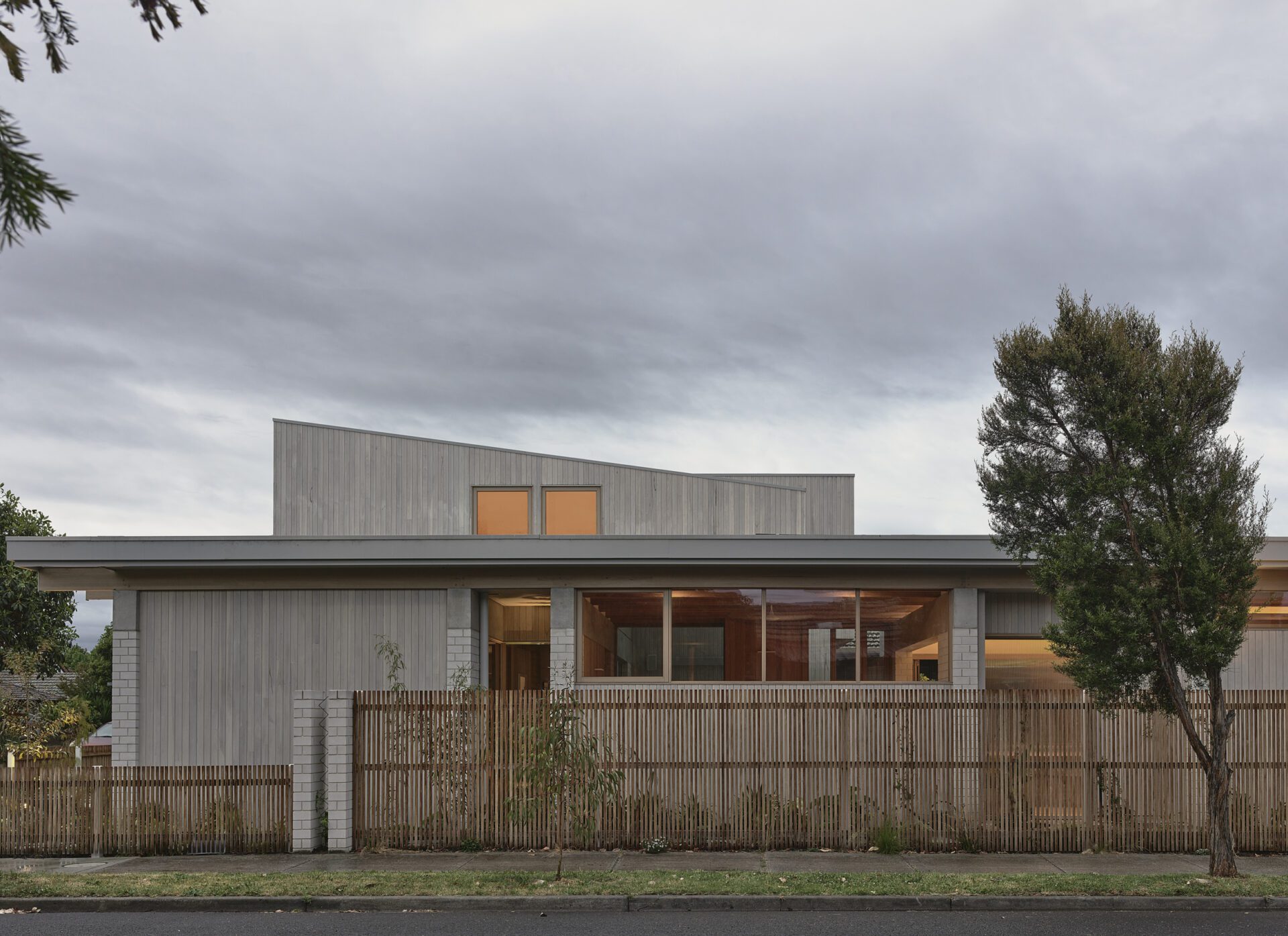

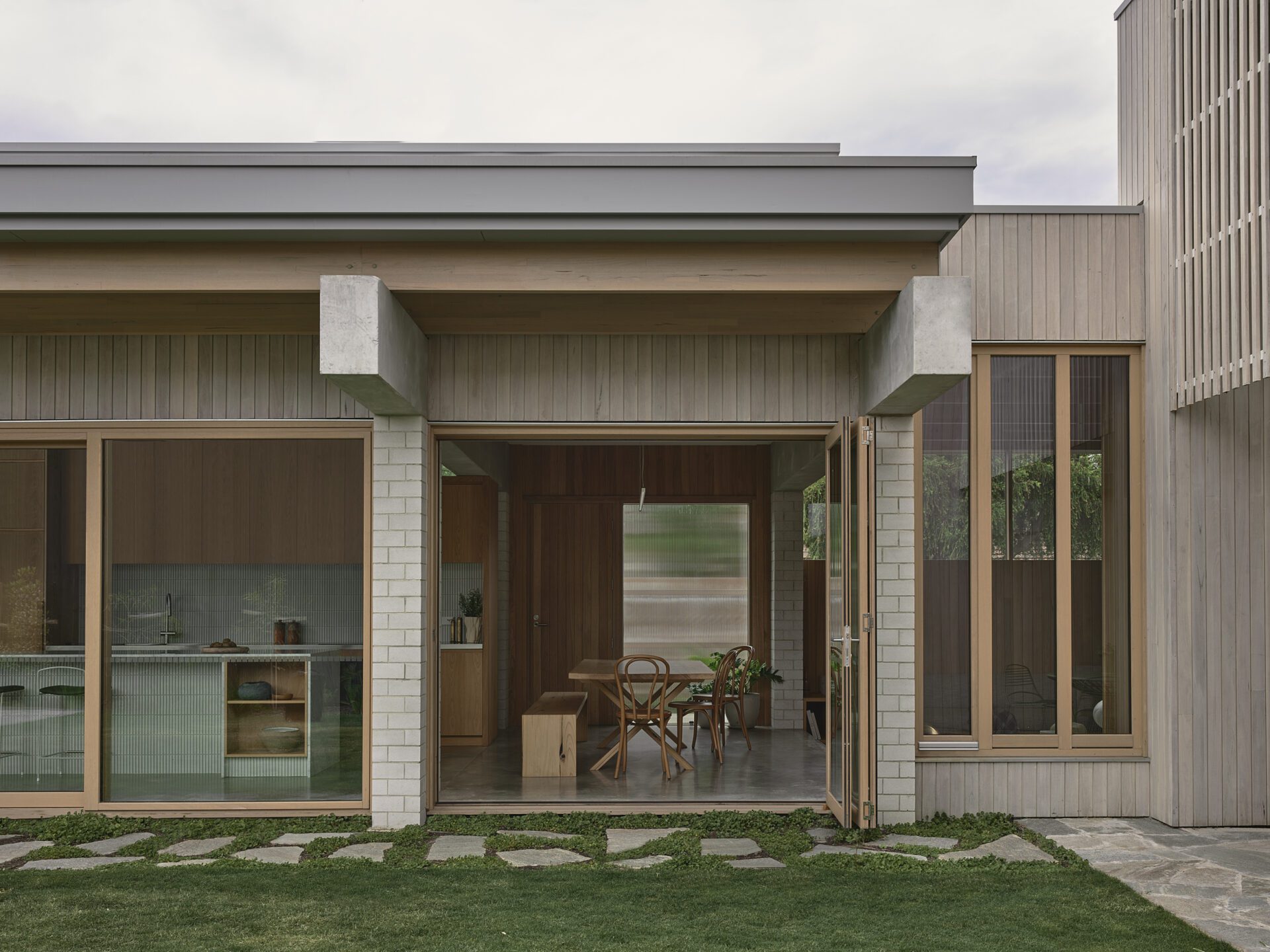
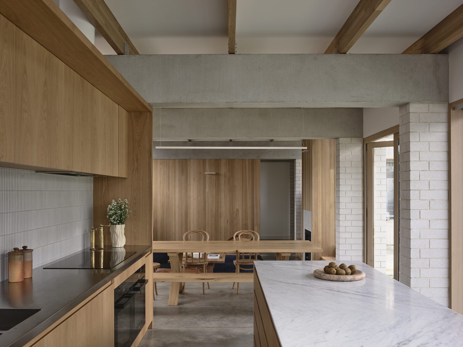
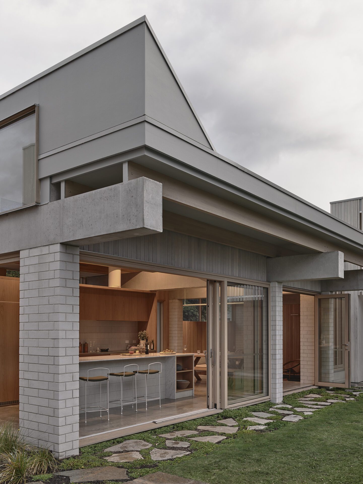
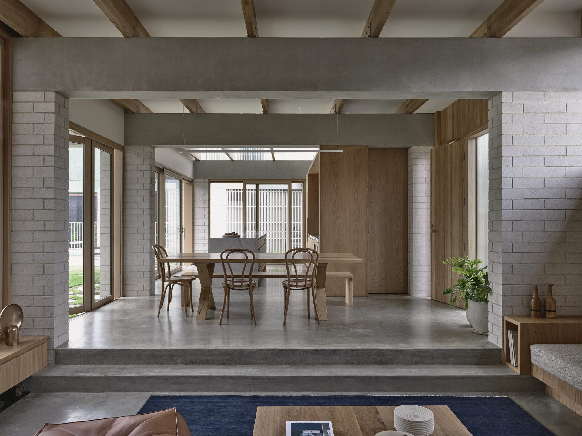
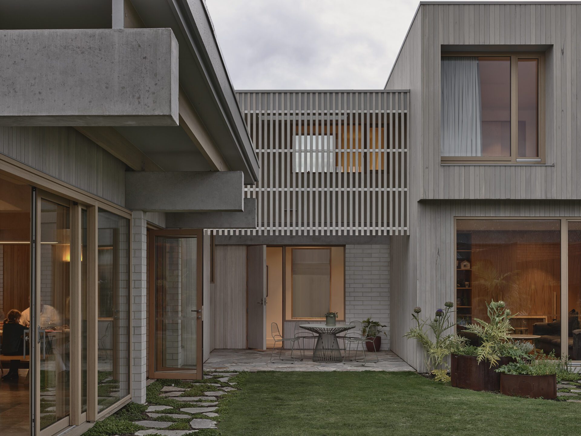
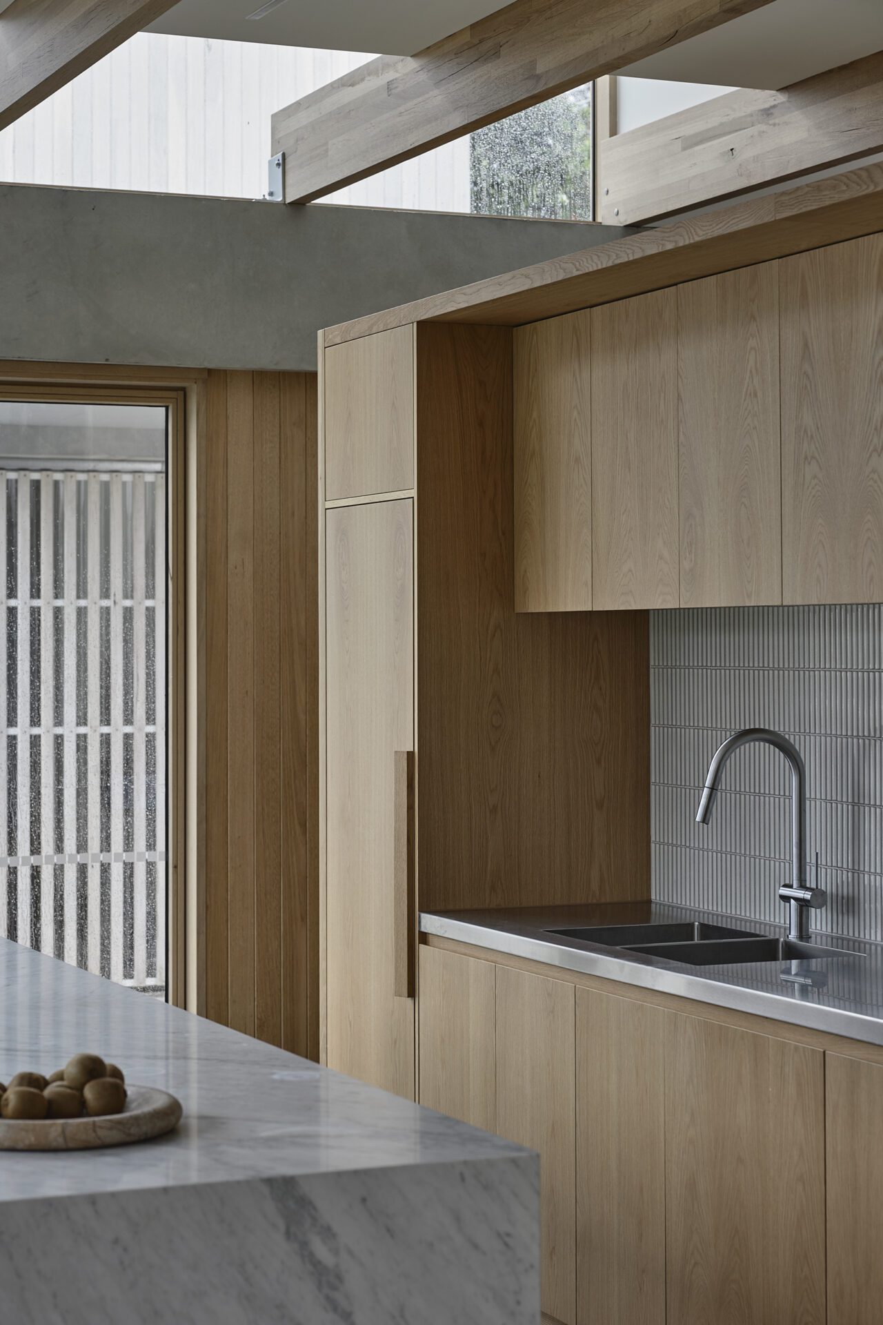
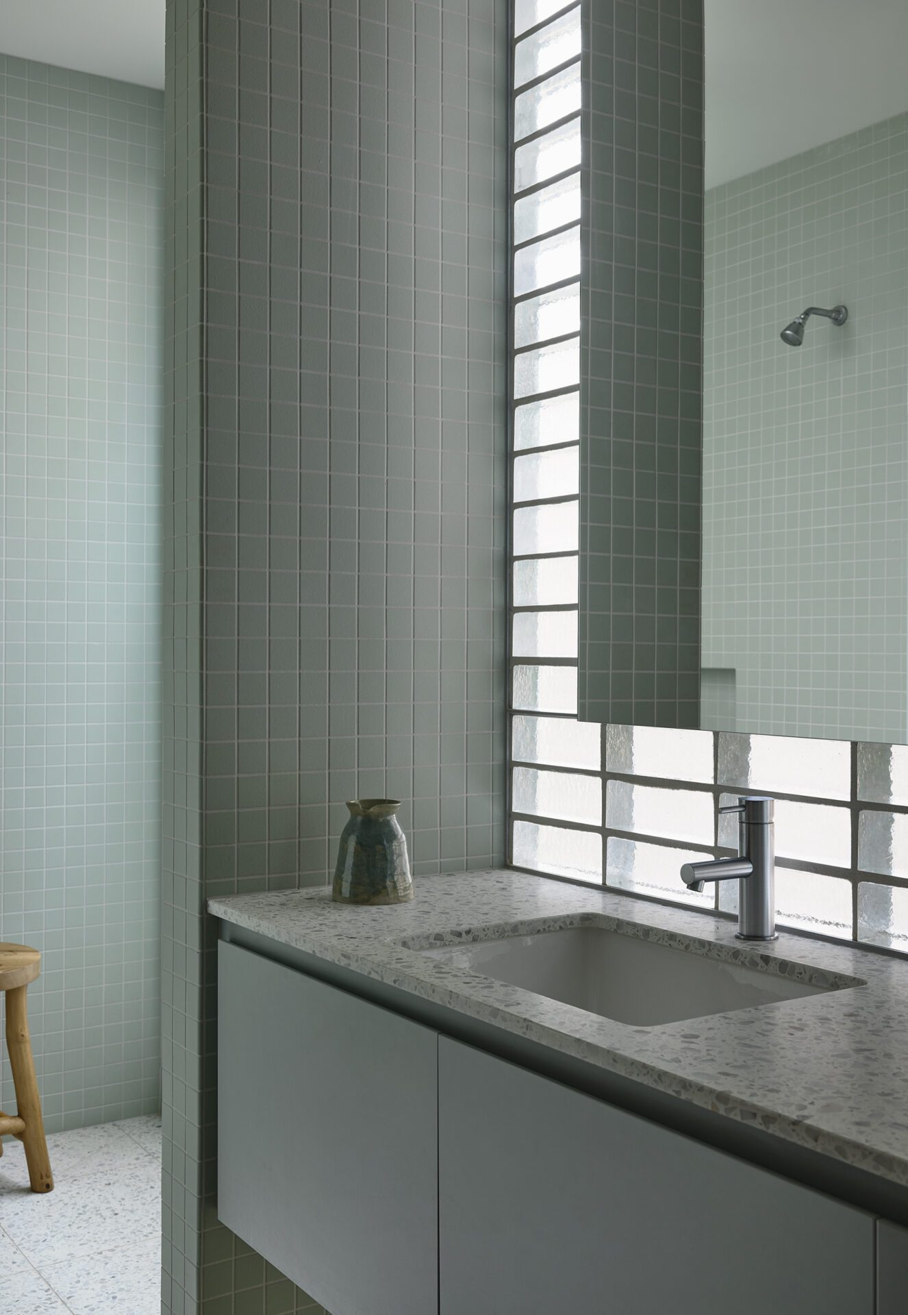
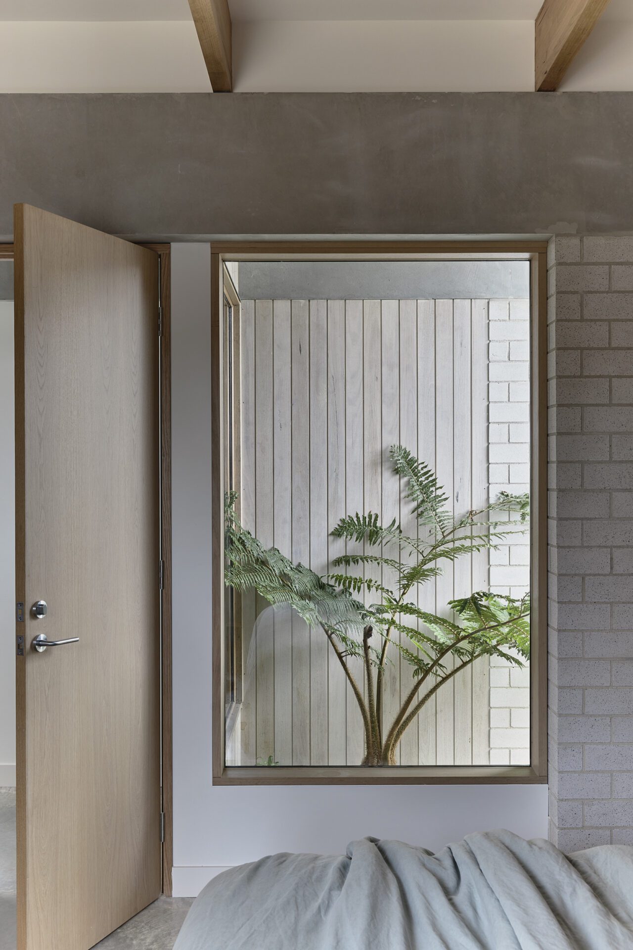

The owners are a young family that had been renting in the area for some time and were looking to establish a long-term home in the area to stay near the local school and remain connected to friends nearby. They have vibrant social life and the ability to host large social occasions at their home was key to them. One of the clients had grown up in an Eichler house in San Francisco and was keen to explore the formal and spatial qualities of these mid-century designs without creating a southern hemisphere facsimile.
The site is a corner block located at the boundary of Northcote and Fairfield, the area is flat and very suburban in character. Typically, the lots are large, over 500m2, and with no heritage overlay but located relatively close to the city, have become popular for both new homes and dual occupancy developments.
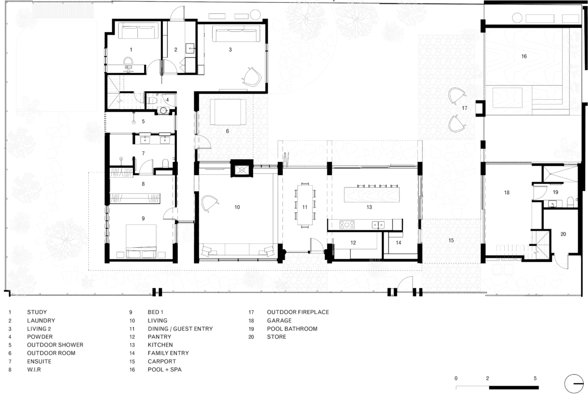
A corner block creates a series of unique challenges in the design of the home, the need to create open living areas directly connected to garden spaces while also providing the necessary privacy from the two street frontages. A study of the surrounding area indicated that the typical response to a corner lot in the area is a two-storey volume at the intersection, an outcome that we were keen to avoid. Our proposal places two smaller footprint double storey volumes at the edges of the site will keeping reducing visual impact at the more public corner at a single level and bookending the edges of the home rather than the centre.
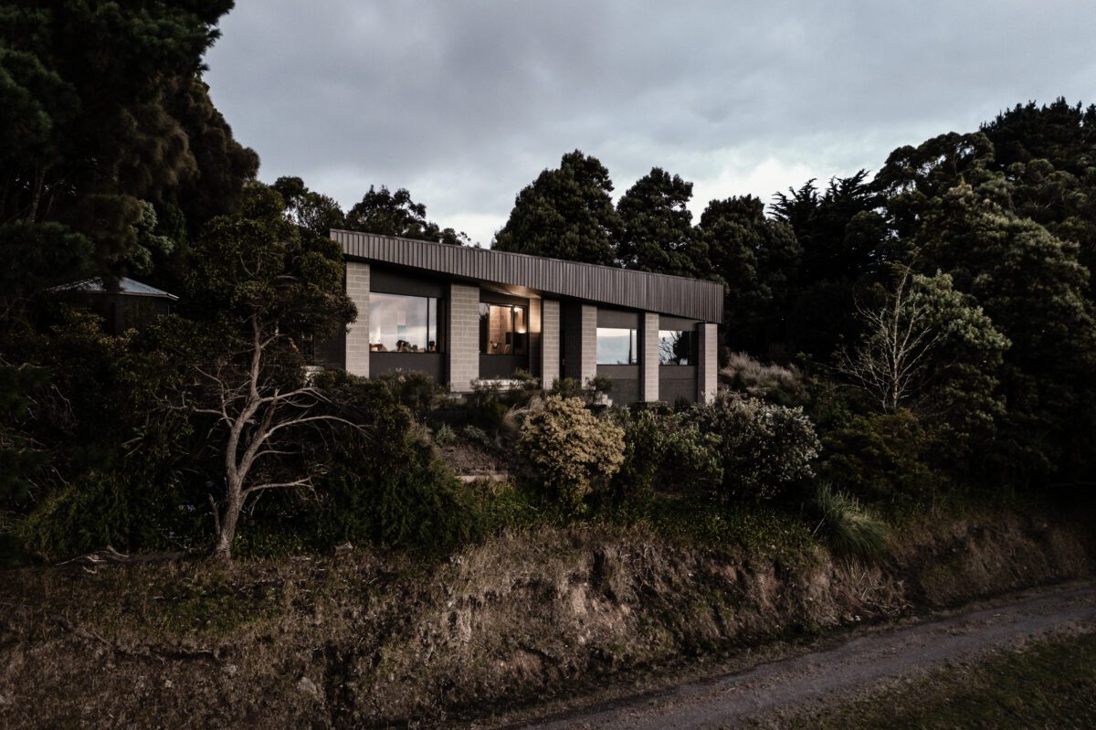
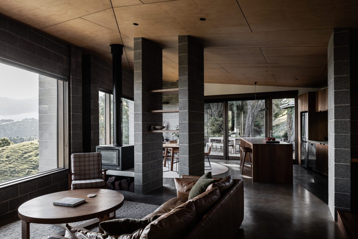
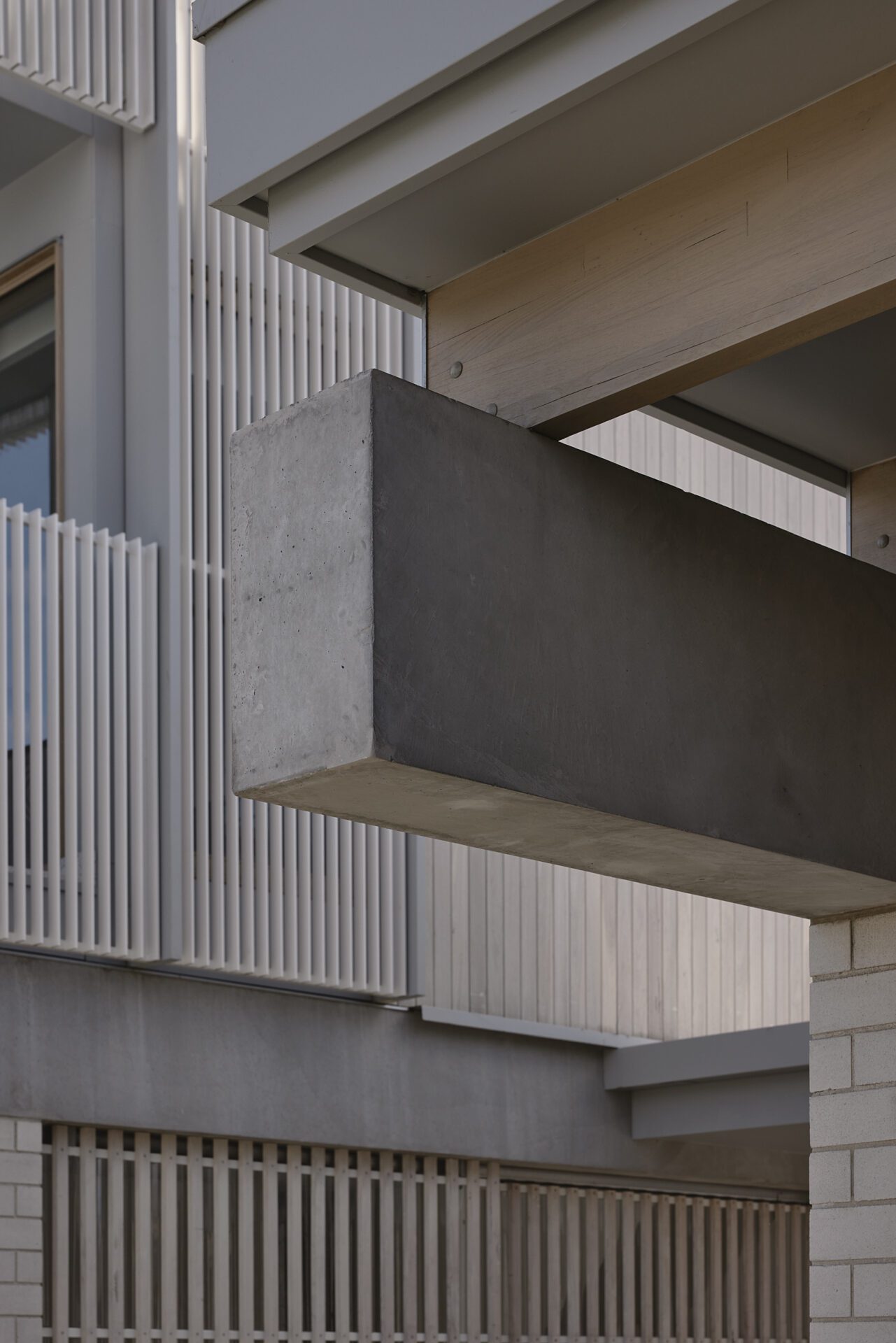
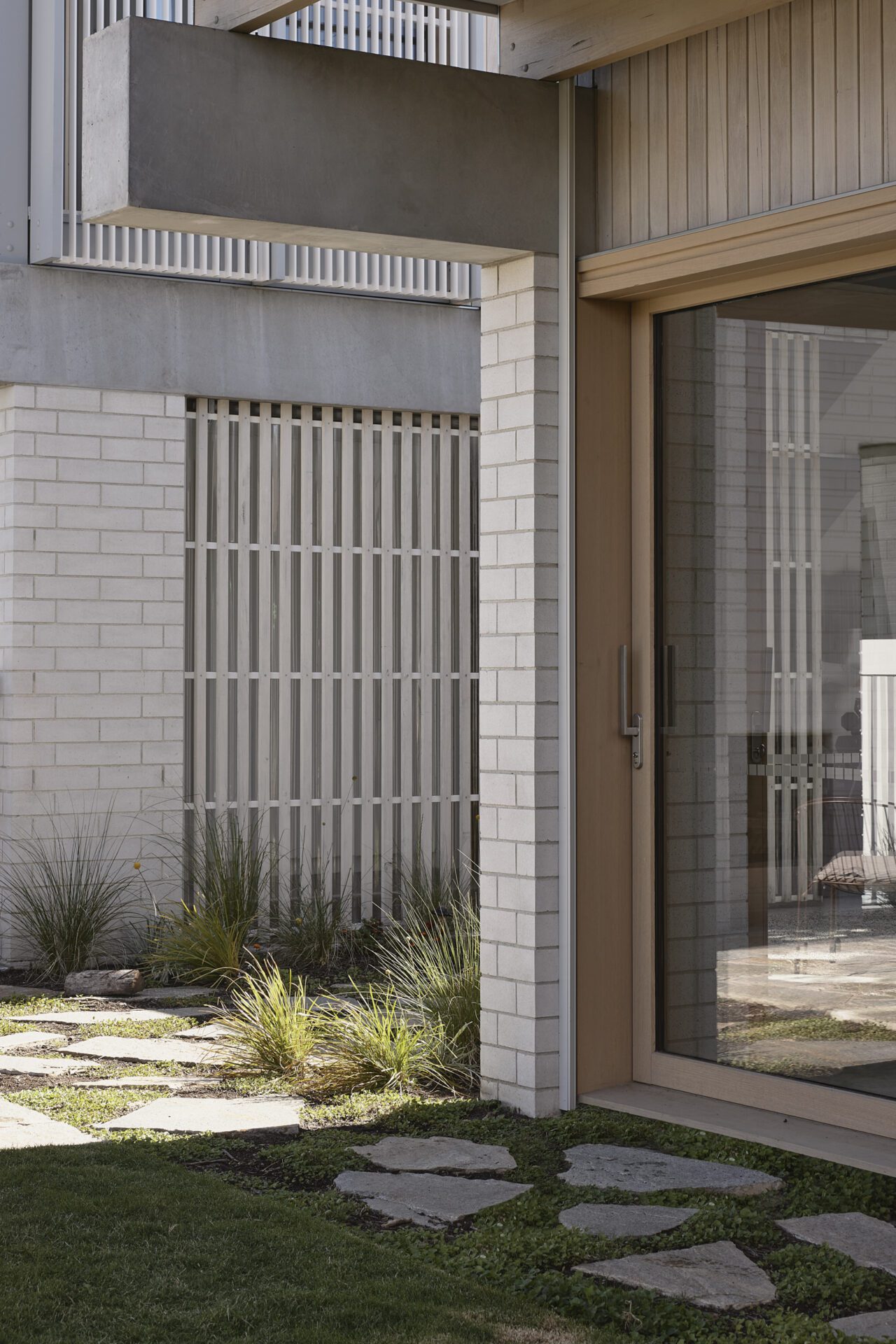
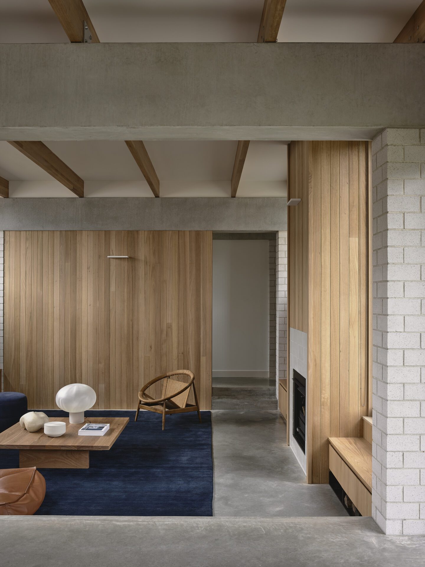
In developing the design, we were interested in defining the pavilions through a series of structural elements rather than by creating enclosed volumes. The plan is arranged via a series of masonry blade walls that support oversized concrete beams that in turn support a series of timber rafters. The mannered post and lintel expression provide the structure of the spaces, the materiality of the pavilion and also defines the social spaces of the home.
Built by Resicon
Photos by Derek Swalwell
The details
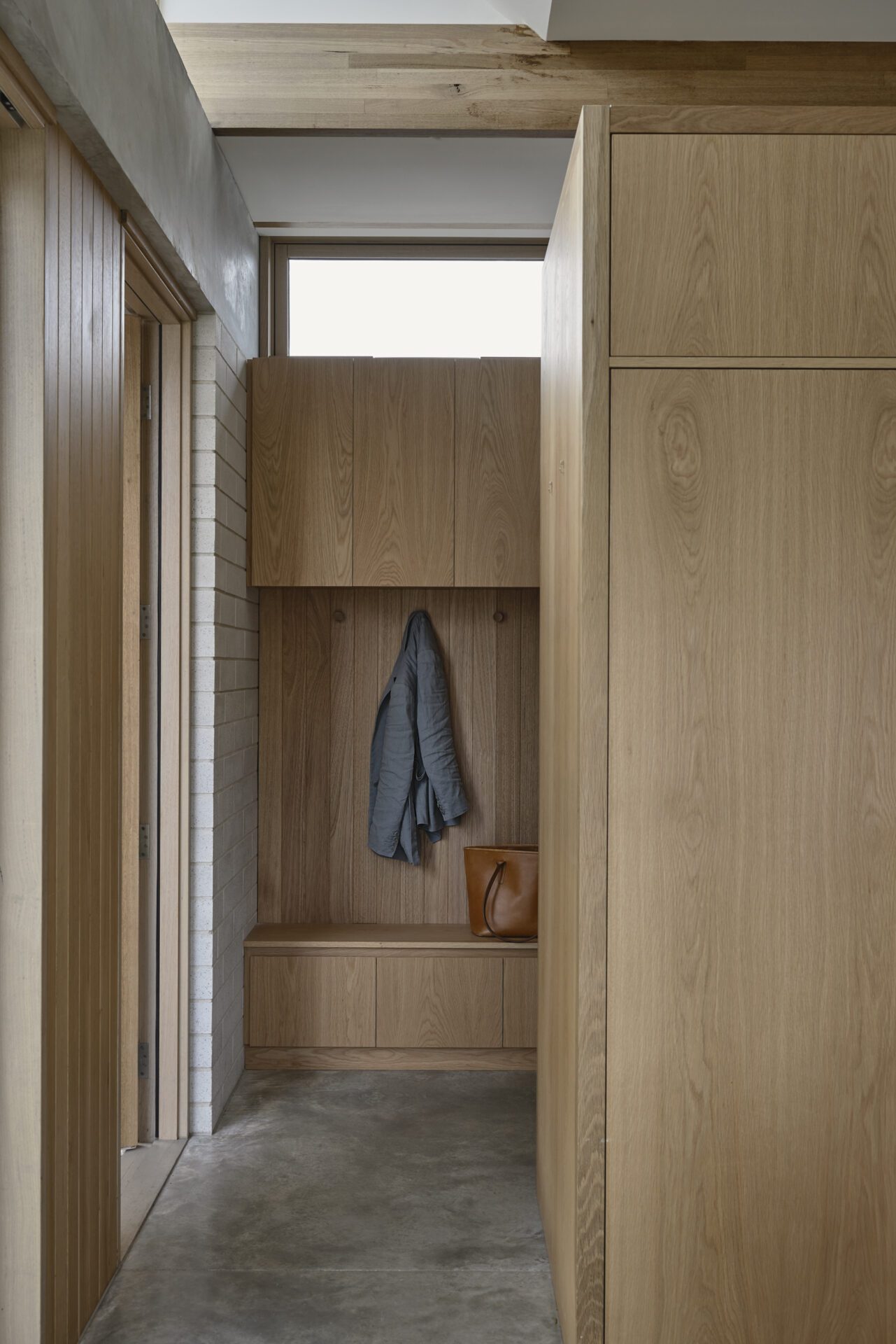



We came to Antony and MRTN with a brief that had various specifics which they managed to incorporate well in a collaborative fashion with us. The end result is a timeless home that is beautiful, well-orientated, and purpose built to our family’s lifestyle and with the ability to absorb guests and entertain in a stylish, yet easy going manner. The layout of the house suits the interactions of our young family and the kids area particularly will be adaptable as they grow and become more independent.
Lucy, clientAwards
Houses Awards 2025
Shortlisted New House over 200m2
